CSS Subgrid
⚡ TL;DR
Grid is amazing for unique layout. But alignment between different sibling was impossible. Which is everywhere in content/data driven website. Subgrid fixes this.
🧪 Experiment
❌ Your browser does NOT support the feature tested below. Try another browser
2 sibling grids with their content aligned together horizontally and vertically
Fake title 1 - Fake title 1 - Fake title 1 - Fake title 1 -


And now a small fake paragraph lorem ipsum life is beautiful.
Footnotes about the main article image.
Fake title 2 - Fake title 2 - Fake title 2 - Fake title 2 - Fake title 2 -


And now a small fake paragraph lorem ipsum life is beautiful. And now a
small fake paragraph lorem ipsum life is beautiful. And now a small fake
paragraph lorem ipsum life is beautiful.
Footnotes about the main article image.
<div class='subgrid-demo-1-container'>
  <div class='grid-1'>
    <div class='title'>Fake title 1 -</div>
    <div class='author'><img alt='portrait raphael glitch' /></div>
    <div class='image'><img alt='arctic portrait'/></div>
    <div class='text'>And now a small fake paragraph...</div>
    <div class='footnotes'>Footnotes about the main article image.</div>
  </div>
  <div class='grid-2'>
    <div class='title'>Fake title 2 -</div>
    <div class='author'><img alt='portrait raphael glitch' /></div>
    <div class='image'><img alt='arctic landscape'/></div>
    <div class='text'>And now a small fake paragraph...</div>
    <div class='footnotes'>Footnotes about the main article image.</div>
  </div>
</div>
.subgrid-demo-1-container,
  .grid-1,
  .grid-2 {
    display: grid;
  }

  .subgrid-demo-1-container {
    grid-template-columns: 1fr 1fr 1fr 1fr 1fr 1fr;
    grid-template-rows: repeat(6, auto);
    column-gap: 30px;
  }

  .grid-1,
  .grid-2 {
    grid-template-rows: subgrid;
    grid-template-columns: subgrid;
    column-gap: 15px;
    row-gap: 15px;
    grid-row: 1 / 6;
    grid-template-areas:
      "title title title"
      "author text text"
      "image image image"
      "footnotes footnotes footnotes";
  }

  .grid-1 {
    grid-column: 1/4;
  }

  .grid-2 {
    grid-column: 4 /7;
  }

  .title {
    grid-area: title;
  }

  .image {
    grid-area: image;
  }

  .text {
    grid-area: text;
  }

  .author {
    grid-area: author;
  }

  .footnotes {
    grid-area: footnotes;
  }
🤔 Opinion
- No support for Chromium, not even behind flag 😬
- Awesome, because in reality it is always nested in sibling
- Not that straight forward, it will require practice, as with CSS grid in general
📚 Resources
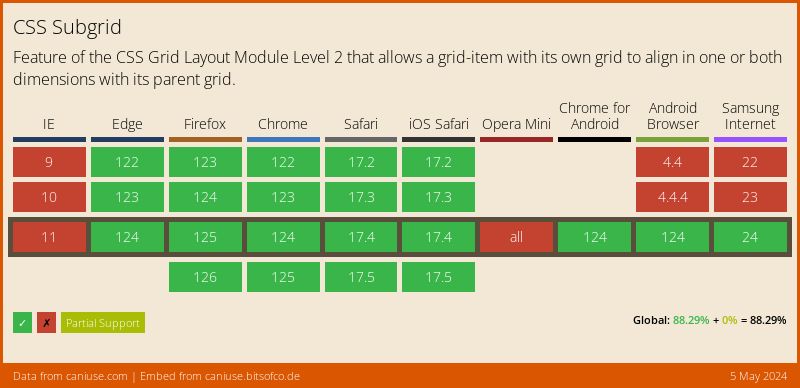
💻 Support